30 years in a new dress
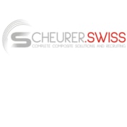
Scheurer Swiss presents its new logo and sets an important milestone for the future with its new brand identity.
The rebranding of the fibre composite specialist and recruiter, Scheurer Swiss GmbH, represents the continuous development of the brand, products and services – and thus the growth of the company. Following the change of name and the new website, the logo now also visibly represents to the outside world what Scheurer Swiss for many years has successfully stood for: a dynamic and innovative Swiss company with the expertise of over 30 years of Formula 1 engineering and a comprehensive, globally unique range of services from a single source that goes far beyond motor sports engineering.
New brand identity shows company orientation
More than 30 years of experience in composite engineering in Formula 1, the royal class of motor and racing sports, distinguish Scheurer Swiss GmbH. The specialist in the field of fibre composite technology has also been able to demonstrate its expertise in the development of customer-specific composite components made of carbon, glass fibre or other fibre composite materials in numerous well-known projects in other internationally important sectors such as aerospace, defence and security, nautics and industry. Since March 2019 Scheurer Swiss has also been one of the state-licensed recruitment agencies – since then it has been successfully recruiting, hiring and placing competent specialists in a wide range of fields. The new logo of the fibre composite specialist and recruiter now also represents externally what has been the programme for many years: Dynamism, innovation and competence of the Swiss company, proven in the provision of top performance, combined with a globally unique all-round service – for highly efficient individual and needs-based customer solutions with an optimal cost-benefit ratio.
Important milestone
“We are proud of the change that our company has successfully undergone in recent years,” says Dominik Scheurer, CEO of Scheurer Swiss GmbH. In its early days, today’s Scheurer Swiss was a design and engineering company mainly active in racing and motor sports.

Dominik Scheurer, CEO of Scheurer Swiss GmbH and responsible for Human Resources and Composite Training.
“With the vision in our luggage of making the high performance, precision and efficiency of fibre composite materials available to customers in other industries in an all-round service package, we have gradually advanced into other important areas in recent years. First and foremost in the aerospace industry. This is not least thanks to our maximum level of competence and experience from Formula 1,” continues Scheurer. “We had outgrown our old identity. A rebranding was the logical consequence,” announces Scheurer.

Carina Petarra-Ferrante is Head of Marketing at Scheurer Swiss GmbH and responsible for Public Relations.
In order to give the new orientation the appropriate appearance, the company brought professional marketing support into the team at the end of 2018 and has continuously adapted its brand identity ever since. The strategic principles of the new corporate design were not developed by external agencies but deliberately internally by the marketing department and implemented with the involvement of the company’s top management. The new look is completed with the redesign of the logo. “The aim was to create a logo that represents us as a Swiss company and at the same time looks modern and technical. Dynamics and competence as well as the unique all-round service were to be embodied without completely forgetting our roots in racing,” is how Carina Petarra-Ferrante, Marketing and PR Manager of Scheurer Swiss GmbH, describes the strategy.
More than just a new logo
Since the end of 2018, the brand identity of the former Scheurer & Co. Design & Engineering has been gradually adapted to the new corporate strategy. Starting with the change of name to the current Scheurer Swiss GmbH, followed by a complete relaunch of the website, the rebranding is reflected in the new, forward-looking logo, in the course of which the company’s corporate colours and fonts were also modified. The new logo is not only an unmistakable sign, it is also the epitome of the change and growth of the Swiss engineering and recruiting company in recent years and symbolizes the internationally active, successful Scheurer Swiss GmbH today.  “The company and brand have undergone a transformation in recent years with the constant expansion of the target group to include various industries and the extended range of services, which we are addressing with the new brand strategy. It was time to present the new era to the outside world with a new and contemporary corporate image,” says CEO Dominik Scheurer.
The “Scheurer Swiss” brand
With the name change to “Scheurer Swiss GmbH”, the specialist for development and design of fibre composite components opened a first chapter in the new external presentation of the company. “The Swiss precision and quality as well as the certainty of having a reliable and innovative partner at their side are highly appreciated by our international customers and have been part of our success story since the beginning”, says Scheurer. For this reason, the new company name should bear Switzerland in its name and also represent the Swiss in terms of colour. The company went one step further and successfully applied for one of the rare dot.swiss domains awarded by the Swiss government. The coveted top-level domain unmistakably stands for the origin and anchoring of Swiss companies and profiles them both in their home market and far beyond their national borders. It lends exclusivity to the web presence and creates added value for the holder of the domain, because it underlines the identification with the Swiss brand and its values “quality, innovation and reliability”. CEO Scheurer confirms: “It is a great honour for us to have been chosen for the coveted dot.swiss domain. We wear it with due pride and are very grateful that we are able to present our corporate values, which we live by every day, in our external appearance.
Rewrapped into the future
In an increasingly demanding world where quality, innovation, dynamism and efficiency are paramount, more than ever before a company must distinguish itself with an individual, unique strategy – and convey this through the brand. “We are convinced of our proven, globally unique approach to offering customers in the field of fibre composite technology an advanced and highly efficient all-round service from a single source, which goes far beyond consulting, design, development, construction and production of fibre composite reinforced composite components,” confirms CEO Scheurer.

The brand emblem of Scheurer Swiss GmbH is a central component of the new brand strategy and gives the company an unmistakable identity.
The new logo visualizes this complete approach – whose components can also be used individually and outside the field of fibre-reinforced composites – through the circular, dynamic point tail, which simultaneously represents the roots and dynamics of Formula 1 and the experience and competence of Scheurer Swiss GmbH gained from it, interpreting it as a wheel in motion and the “S” from “Scheurer” as a racetrack. The brand emblem resulting from this combination is a symbol for Scheurer Swiss and will provide great scope for the new brand in the future. “The emblem is a central component of our new brand strategy and gives us a distinctive identity. It can be used everywhere,” explains Scheurer. The quality and precision befitting a Swiss company is embodied by the dot.swiss domain, which is deliberately obvious given the company’s international activities.
Your project in good hands
Scheurer Swiss GmbH is the perfect partner when it comes to product development with state-of-the-art fibre composite technologies, personnel recruitment and composite training. We will be happy to advise you!

 Scheurer Swiss GmbH
 Scheurer Swiss GmbH
 Scheurer Swiss-Schweizer Luft- und Raumfahrt
 Scheurer Swiss GmbH
 Scheurer Swiss-Mount10

 Scheurer Swiss GmbH-ETH Zürich